Leer versión en español acá.
If you draw your own SVG files or if you download them from the internet, tools like this SVG-Editor or SVGOMG are your friends. Compressing the files with those tools takes only a few seconds and reduces your file size a lot. But if you need to use your SVG inline to animate or interact with the code, there’s still a lot you can do about code legibility.
Reusing content with SVG’s <use> is not always an option, but when it is, you won’t regret taking a few extra minutes to put it in practice.
In this article, I’ll show an example where I was able to take a lot of advantage of this element — not only for keeping the file size down but also a cleaner markup that became more legible and easy to maintain.
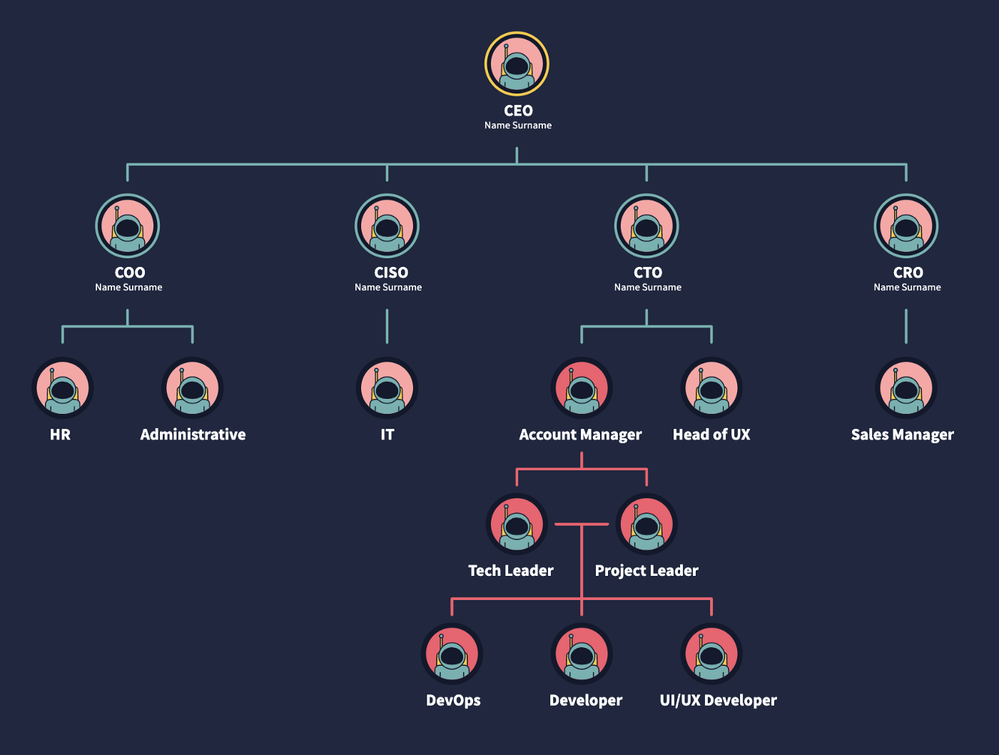
This is the first design that I needed to work with. It was originally created in Illustrator:

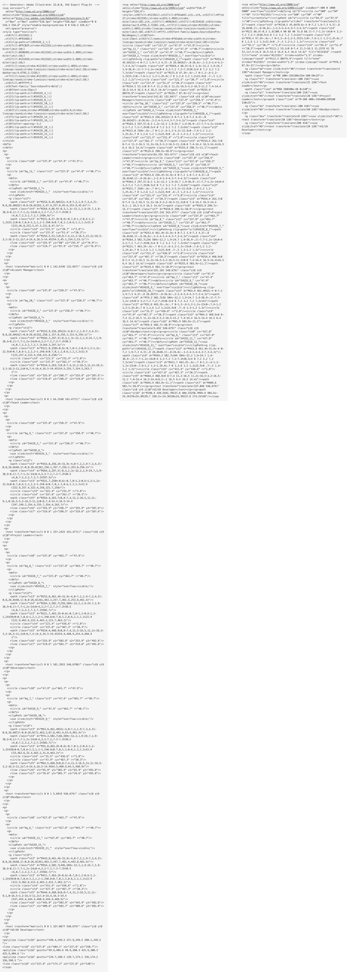
Take a look at the following code, this is the original file exported directly from the software, weighs 2.05kb:
It’s not a heavy file at all. However, open it and you’ll find there are lots of empty tags, deprecated namespaces, unnecessary white space, commas and extra information applied by the software. This makes the code hard to work with, annoying to scan and creates a big scroll for those hundreds of lines in your document.
You’ll also notice that the file is indeed using <use> and <defs> elements, but not in the best way it could. And that’s not the software’s fault! Each astronaut illustration in the original file has a clipping mask: an invisible circle that acts like a window through which we can see our character. Without it, the suit of the astronaut would be flooding outside the circle. There are a few ways to avoid this in Illustrator, like cropping those extra parts with a pathfinder option. That way we would gain a few bytes and avoid using an extra circle only for clipping information of the graphic that we won’t show. The compression of the file starts in the software. Still, there are a lot of things we’ll be able to improve on the code in case we don’t want to edit the original file.
Compressing the SVG with SVGOMG and keeping the default options won’t take any effort and you’ll get a file that weighs 1.46kb. That's a reduction of 30% compared to the original and the graphic will look exactly the same.
Reusing content
This will require going through the SVG and making some adjustments. I know this option takes more time regarding the previous example, but it’s not as hard as it seems.
We have one repeated element, which is the astronaut inside the circle. That’s the one we’ll compress on SVGOMG. The result will look something like this:
<svg xmlns="http://www.w3.org/2000/svg" xmlns:xlink="http://www.w3.org/1999/xlink" viewBox="0 0 95.8 95.8">
 <style>.st3,.st4{fill:#ffcb2f;stroke:#12192c;stroke-width:1.4891;stroke-miterlimit:10}.st4{fill:#69b2b1}</style>
 <circle cx="47.9" cy="47.9" r="47.9" fill="#12192c"/>
 <circle cx="47.9" cy="47.9" r="40.7" fill="#f6a2a4"/>
 <defs><circle id="SVGID_1_" cx="47.9" cy="47.9" r="40.7"/></defs>
 <clipPath id="SVGID_2_"><use xlink:href="#SVGID_1_" overflow="visible"/></clipPath>
 <g clip-path="url(#SVGID_2_)">
 <path class="st3" d="M63.9 45.6H32c-4 0-7.2 1.9-7.3 4.3l-.8 26.6H72l-.8-26.6c-.2-2.5-3.4-4.3-7.3-4.3z"/>
 <path class="st4" d="M74.3 86.9L66 88.2C53.8 90 41.4 90 29.1 88.1l-7.7-1.2v-14c0-4 3.2-7.2 7.2-7.2h38.5c4 0 7.2 3.2 7.2 7.2v14z"/>
 <path class="st3" d="M31.8 47.3h-.6c-.7 0-1.2-.6-1.2-1.2V23.2c0-.7.6-1.2 1.2-1.2h.6c.7 0 1.2.6 1.2 1.2v22.9c0 .7-.6 1.2-1.2 1.2z"/>
 <circle class="st4" cx="31.5" cy="20.7" r="2.8"/>
 <circle class="st4" cx="47.9" cy="51.4" r="20.3"/>
 <path d="M64.5 53.1c0 8-7.4 11.2-16.5 11.2S31.4 61 31.4 53.1s7.4-14.4 16.5-14.4 16.6 6.4 16.6 14.4z" fill="#13192d" stroke="#12192c" stroke-width="1.489" stroke-miterlimit="10"/>
 <path fill="none" stroke="#12192c" stroke-width="1.489" stroke-linecap="round" stroke-linejoin="round" stroke-miterlimit="10" stroke-dasharray="9.6793,3.7228" d="M65.9 88V76.9"/>
 <path fill="none" stroke="#12192c" stroke-width="1.489" stroke-linecap="round" stroke-linejoin="round" stroke-miterlimit="10" d="M29.6 87.9v-11"/>
 </g>
</svg>
First recommendations:
- Move the
<style>content to the CSS file (assuming you can use your SVG inline and that you have a stylesheet linked in your document). - Rename the IDs with something that makes sense to you.
- Round those complicated numbers, like
stroke-width="1.489"tostroke-width="1.5". This is something that could happen if you resize your vectors in Illustrator with the option of scaling borders checked. - Remove the
stroke-miterlimit="10"as we don’t need it since ourstroke-linejoinis round. - This code will be our astronaut template. We need to wrap everything in a group, add an ID to that group and place it inside a
<defs>tag. Notice that we already have a<defs>element with a circle inside it. We can remove that one as it will be part of a bigger<defs>tag.
Notice that the first two circles are filled shapes with different radius and color. We can keep the smaller one and add a stroke big enough to achieve the same effect — again, something that we could avoid using a circle with border in Illustrator in the first place.
Another important thing is that our current viewBox is too small for what we want to build. Let’s make it bigger and add some negative space on the x-axis so we can start cloning our astronaut from the middle.
To learn more about viewBox, check out this beautiful guide to scaling SVG by Amelia Wattenberger.
We will end with something like this:
<svg xmlns="http://www.w3.org/2000/svg" xmlns:xlink="http://www.w3.org/1999/xlink" viewBox="-400 0 1000 5000">
<defs>
 <g id="astronaut">
 <circle cx="94.5" cy="48" r="44" fill="currentColor" stroke="#12192c" stroke-width="8"/><clipPath id="a"><circle cx="94.5" cy="47.9" r="40"/></clipPath>
 <g clip-path="url(#a)"><path class="st3" d="M110.5 45.6H78.6c-4 0-7.2 1.9-7.3 4.3l-.8 26.6h48.1l-.8-26.6c-.1-2.5-3.4-4.3-7.3-4.3z"/><path class="st4" d="M121 86.9l-8.3 1.3C100.4 90 88 90 75.8 88.1l-7.7-1.2v-14c0-4 3.2-7.2 7.2-7.2h38.5c4 0 7.2 3.2 7.2 7.2v14z"/><path class="st3" d="M78.4 47.3h-.6c-.7 0-1.2-.6-1.2-1.2V23.2c0-.7.6-1.2 1.2-1.2h.6c.7 0 1.2.6 1.2 1.2v22.9c0 .7-.5 1.2-1.2 1.2z"/><circle class="st4" cx="78.1" cy="20.7" r="2.8"/><circle class="st4" cx="94.5" cy="51.4" r="20.3"/><path d="M111.1 53.1c0 8-7.4 11.2-16.5 11.2S78 61 78 53.1s7.4-14.4 16.5-14.4 16.6 6.4 16.6 14.4z" fill="#13192d" /><path fill="none" stroke="#12192c" stroke-width="1.5" stroke-linecap="round" d="M112.5 88V76.9"/><path fill="none" stroke="#12192c" stroke-width="1.5" stroke-linecap="round" d="M76.3 87.9v-11"/></g>
 <g>
</defs>
</svg>
What goes inside the <defs> won’t render anywhere. To start cloning our astronaut, we need to link its ID inside a <use> element like this:
<use xlink:href="#astronaut"/>
_xlink:href_is deprecated since SVG2, but is better to use it for compatibility purposes. You can use href in modern browsers, but I tested it on Safari and it wasn’t working as of this writing. If you usexlink:href,make sure you include this namespace in your SVG tag:_xmlns:xlink="http://www.w3.org/1999/xlink_(you won’t need it if you decide to use_href_).
Now we can add the corresponding text to this first figure and align it with the transform attribute. We better place both elements inside a group so in the future instances we’ll be able to translate the whole group to the position we want:
<g transform="translate(-95 210)">
 <use xlink:href="#astronaut"/>
 <text transform="translate(25 130)">Tech Leader</text>
</g>
The connecting lines are simple shapes that can be drawn directly with <path>. Paths look scary but, for rect lines, there is not much to worry about. I’ll explain this code:
<path class="line" d="M-4 200v-25h200"/>
d="" is for data and that’s where we’ll place our commands. M is to move our hand to the place where we’ll start drawing (but it’s not drawing anything). -4 200 means we place our pencil four units to the left and 200 to the bottom of our viewBox (following the orientation of the SVG coordinate system). v is the command to start drawing a vertical line that will go from this place to -25 units up. h is for horizontal, so we’re drawing a line from there to 200 to the right. It feels like logo writer.
I separated the lines in three paths, but we can use just one with the M value after a series of commands to move our hand and start drawing from a new point in the coordinate system.
Take a look at the final document. Now the file weighs 779 bytes and has 12 lines of legible and scalable code:
If we declare any value in the attributes we defined in the <defs> then it won’t be possible to change it in their clones because of the nature of the <use> element. That’s why in the example above the fill of the main circle was replaced with a value of currentColor to have control of the backgrounds of all the replications. currentColor will inherit the CSS color value of the element (or any element above it). In the SVG, I’m adding a class to some replicated astronauts and adding a color value in CSS to those classes. This way, I’ll be able to change all instances of the <use> element with that class. To understand more about <use> and how to style its content, this post by Sara Soueidan has everything you need to know.
With this code ready, we’ll be able to scale the graphic to something like this much more easily:

This is the complete code:
Here are the three examples side by side to compare legibility and amount of code, we went from 241 to 12 neat lines:

This article was first published on CSS-Tricks with edits from Chris Coyier and Geoff Graham