Read the Chinese version here. Translated by Rotten orange 腐烂的橘子
There are different ways to work with icons, but the best solution always includes SVG, either inline or linked up as a file. Sometimes the icons we download (or the ones we create with a drawing software) have a lot of unnecessary code that if we use it inline makes our document longer to scroll, uncomfortable to work with, and just a little bit heavier.
We can work around this reusing chunks of code with the <use> element or apply native variables to manage our SVG styles from one place.
Here I want to focus on a different perspective: how to make the same figures with less amount of code using basic shapes. And get the benefits of smaller, controllable, and semantic icons in our projects without sacrificing quality or visual changes. I'll go through different examples that explore the code of commonly used icons and how we can redraw them using some of the easiest SVG shapes we can make.
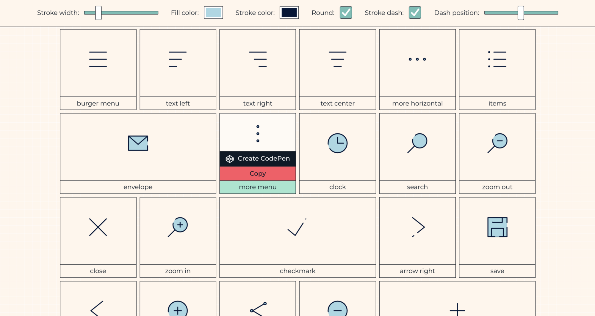
These are the icons we'll be working on:

Let's look at the basic shapes we can use to make these that keep the code small and simple.
Psssst! Here is a longer list of simple icons I created on holasvg.com! After this article, you'll know how to modify them and make them your own.
Building a close icon with the <line> element
This is the code for the close or cross icon that was downloaded from flaticon.com and built by pixel-perfect:
In this example, everything is happening inside the <path> with lots of commands and parameters in the data attribute d. What this SVG is doing is tracing the shape from its borders.

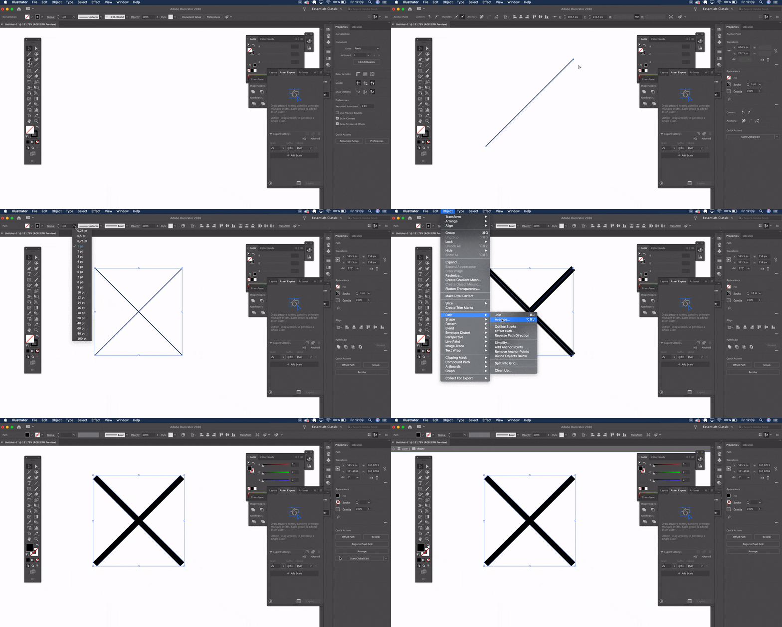
If you are familiar with Illustrator, this is the equivalent of drawing two separate lines, converting them to shape, then combining both with the pathfinder to create one compound shape.

The <path> element allows us to draw complex shapes, but in this case, we can create the same figure with two lines, while keeping the same appearance:
<svg xmlns="http://www.w3.org/2000/svg" viewBox="0 0 50 50" width="50" height="50" overflow="visible" stroke="black" stroke-width="10" stroke-linecap="round">
   <line x1="0" y1="0" x2="50" y2="50" />
   <line x1="50" y1="0" x2="0" y2="50" />
</svg>
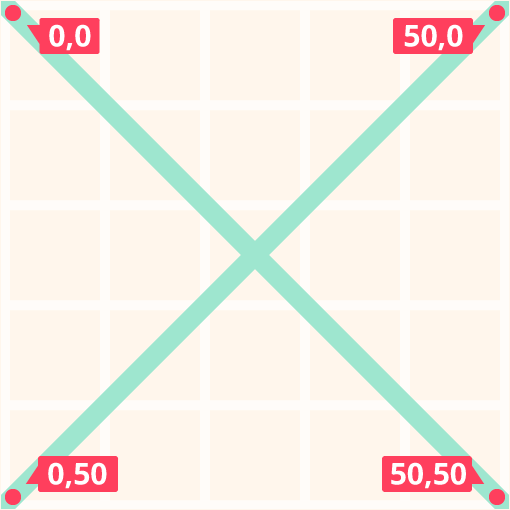
We started by defining a viewBox that goes from 0,0 to 50,50. You can choose whatever dimensions you prefer; the SVG will always scale nicely to any width and height you define. To make things easier, in this case, I also defined an inline width and height of 50 units, which avoids extra calculations in the drawing.
To use the <line> element, we declare the coordinates of the lines first point and the coordinates of its last point. In this specific case, we started from x=0 y=0 and ended at x=50 y=50.

Here's how that looks in code:
<line x1="0" y1="0" x2="50" y2="50" />
The second line will start from x=50 y=0 and end at x=0 y=50:
<line x1="50" y1="0" x2="0" y2="50" />
An SVG stroke doesn't have a color by default that's why we added the black value on the stroke attribute. We also gave the stroke-width attribute a width of 10 units and the stroke-linecap a round value to replicate those rounded corners of the original design. These attributes were added directly to the <svg> tag so both lines will inherit them.
<svg ... stroke="black" stroke-width="10" stroke-linecap="round" ...>
Now that the stroke is 10 units bigger than its default size of 1 unit, the line might get cropped by the viewBox. We can either move the points 10 units inside the viewBox or add overflow=visible to the styles.
The values that are equal to 0 can be removed, as 0 is the default. That means the two lines end up with two very small lines of code:
<line x2="50" y2="50" />
<line x1="50" y2="50" />
Just by changing a <path> to a <line>, not only did we make a smaller SVG file, but a more semantic and controllable chunk of code that makes any future maintenance much easier. And the visual result is exactly the same as the original.
Same cross, different code.
Building a clock icon with the <circle> and <path> elements
I took this example of a clock icon created by barracuda from The Noun Project:
This shape was also drawn with a <path>, but we also have a lot of namespaces and XML instructions related to the software used and the license of the file that we can delete without affecting the SVG. Can you tell what illustration editor was used to create the icon?
Let's recreate this one from scratch using a circle and a path with simpler commands. Again, we need to start with a viewBox, this time from 0,0 to 100,100, and with a width and height matching those units.
<svg xmlns="http://www.w3.org/2000/svg" viewBox="0 0 100 100" width="100" height="100" fill="none" stroke="black" stroke-width="10" stroke-linecap="round" stroke-linejoin="round">
  <circle cx="50" cy="50" r="40"/>
  <path d="M50 25V50 H75" />
</svg>
We keep the same styles as the previous icon inside the <svg> tag. fill is black by default, so we need to explicitly give it a none value to remove it. Otherwise, the circle will have have a solid black fill, obscuring the other shapes.
To draw the <circle> we need to indicate a center point from where the radius will sit. We can achieve that with cx (center x) and cy (center y). Then r (radius) will declare how big our circle will be. In this example, the radius is slightly smaller than the viewBox, so it doesn't get cropped when the stroke is 10 units wide.
What's up with all those letters? Check out Chris Coyier's illustrated guide for a primer on the SVG syntax.
We can use a <path> for the clock hands because it has some very useful and simple commands to draw. Inside the d (data) we must start with the M (move to) command followed by the coordinates from where we'll start drawing which, in this example, is 50,25 (near the top-center of the circle).
After the V (vertical) command, we only need one value as we can only move up or down with a negative or positive number. A positive number will go down. The same for H (horizontal) followed by a positive number, 75, that will draw toward the right. All commands are uppercase, so the numbers we choose will be points in the grid. If we decided to use lowercase (relative commands) the numbers will be the amount of units that we move in one direction and not an absolute point in the coordinate system.
Same clock, different code.
Building an envelope icon with the <rect> and <polyline> elements
I drew the envelope icon in Illustrator without expanding the original shapes. Here's the code that came from the export:
Hey! Illustrator offers some SVG options to export the graphic. I chose Style Elements in the CSS Properties dropdown so I can have a
<style>tag that contains classes that I might want to move to a CSS file. But there are different ways to apply the styles in SVG, of course.
We already have basic shapes in this code! I unselected the Shape to paths option in Illustrator which helped a lot there. We can optimize this further with SVGOMG to remove the comments, XML instructions, and unnecessary data, like empty elements. From there, we can manually remove other extras, if we need to.
We already have something a little more concise:
<svg version="1.1" id="Layer_1" xmlns="http://www.w3.org/2000/svg" x="0" y="0" viewBox="0 0 310 190" xml:space="preserve">
  <style>.st0{fill:none;stroke:#000;stroke-width:10;stroke-linecap:round;stroke-linejoin:round;stroke-miterlimit:10}
  </style><rect x="5" y="5" class="st0" width="300" height="180"/>
  <polyline class="st0" points="5 5 155 110 305 5"/>
</svg>
We can remove even more stuff without affecting the visual appearance of the envelope, including:
version="1.1"(this has been deprecated since SVG 2)id="Layer_1"(this has no meaning or use)x="0"(this is a default value)y="0"(this is a default value)xml:space="preserve"(this has been deprecated since SVG 2)
<svg xmlns="http://www.w3.org/2000/svg" x="0" y="0" viewBox="0 0 310 190">
  <style>.st0{fill:none;stroke:#000;stroke-width:10;stroke-linecap:round;stroke-linejoin:round;stroke-miterlimit:10}
  </style>
  <rect x="5" y="5" class="st0" width="300" height="180"/>
  <polyline class="st0" points="5 5 155 110 305 5"/>
</svg>
We can move the CSS styles to a separate stylesheet if we really want to get really aggressive.
<rect> needs a starting point from where we'll extend a width and a height, so let's use x="5" and y="5" which is our top-left point. From there, we will create a rectangle that is 300 units wide with a height of 180 units. Just like the clock icon, we'll use 5,5 as the starting point because we have a 10-unit stroke that will get cropped if the coordinates were located at 0,0.
<polyline> is similar to <line>, but with an infinite amount of points that we define, like pairs of coordinates, one after the other, inside the points attribute, where the first number in the pair will represent x and the second will be y. It's easier to read the sequence with commas, but those can be replaced with whitespace without having an impact on the result.
Same envelope, different code.
Bonus shapes!
I didn't include examples of icons that can be simplified with <polygon> and <ellipse> shapes, but here is a quick way to use them.
<polygon> is the same as <polyline>, only this element will always define a closed shape. Here's an example that comes straight from MDN:
Remember the circle we drew earlier for the clock icon? Replace the r (radius) with rx and ry. Now you have two different values for radius. Here's another example from MDN:
Wrapping up
We covered a lot here in a short amount of time! While we used examples to demonstrates the process of optimizing SVGs, here's what I hope you walk away with from this post:
- Remember that compression starts with how the SVG is drawn in illustration software.
- Use available tools, like SVOMG, to compress SVG.
- Remove unnecessary metadata by hand, if necessary.
- Replace complex paths with basic shapes.
<use>is a great way to inline SVG as well as for establishing your own library of reusable icons.
How many icons can be created by combining these basic shapes?
I'm working on my list on holasvg.com/icons, I'll be constantly uploading more icons and features here, and now you know how to easily modified them just by changing a few numbers. Go ahead and make them yours!
This article was first published on CSS-Tricks with edits from Chris Coyier and Geoff Graham
